Turning a paper claims form into a service that works
Redesigning an 8-year-old digital replica of a paper form into a service built around caseworkers and providers.
The problem
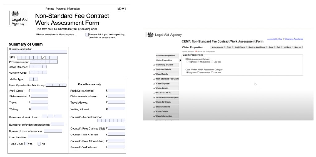
Side by side here you have a paper CRM7 form and the digital eform replica - renamed Non-Standard Magistrates' Court Payment.
The digital version was created 8 years ago because the Legal Aid Agency (LAA) wanted to reduce paper usage. But providers and caseworkers still very much used the paper process, as it was quicker for them.
When the form became digital, no user research was conducted, so it did not address user needs or pain points. We stepped in as a team to improve this journey for our two user groups.
Our users
What I did about the problem
I focused on one of the most critical parts of the caseworker journey - the assessment view, specifically how caseworkers understand what they can view versus what they can adjust on a claim. This sounds straightforward but it wasn't. The information was dense, the work items list could get extremely long, and the sub-navigation structure needed to support both readability and efficient task completion for people doing this work every day.
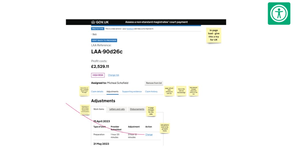
I explored four design directions, looking at how to reduce cognitive load, make adjustments clearly distinguishable from read-only content, and structure the navigation in a way that worked for power users. I reviewed patterns from another LAA service - Crime Review - that shared the same caseworkers, and identified what could be reused rather than reinvented. It came down to two ideas: consolidating adjustable content under a single 'Adjustments' label, and adding tabs within that section to allow caseworkers to switch quickly between work items, letters and calls, and disbursements.
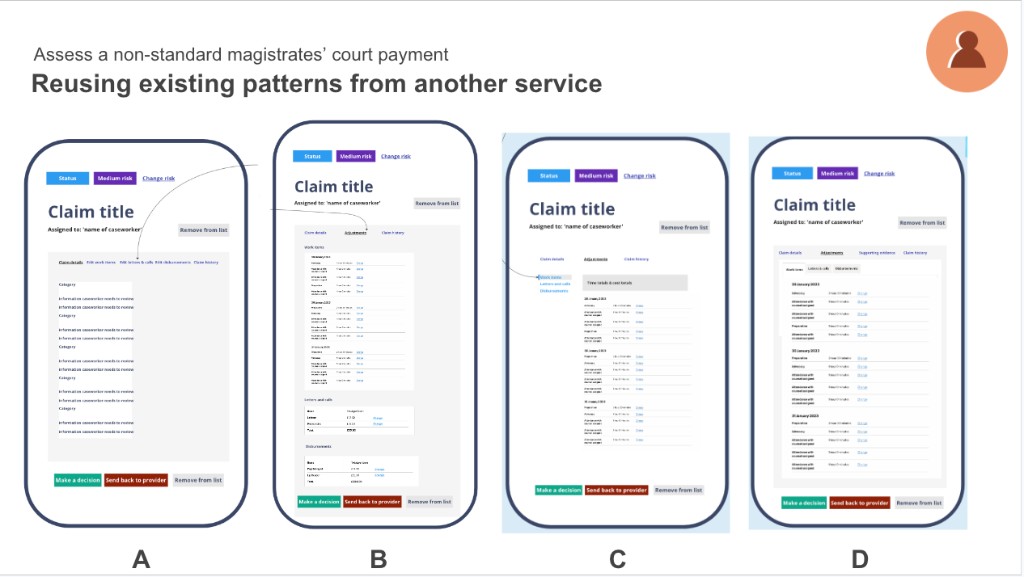
Before committing to the tab pattern I reached out to the MoJ accessibility community to check the approach - specifically whether tabs would trigger a full page refresh or an in-page change, and whether that was accessible. The recommendation came back clearly: full page refresh on the top layer, in-page change for the tab panel. I validated the four ideas with team members, the wider design community, stakeholders, and the accessibility team before moving forward.
I ran end-to-end usability testing sessions - including in-person testing at users' offices - using Figma high-fidelity prototypes, and worked in constant close contact with developers as they built out both the provider and caseworker applications simultaneously.
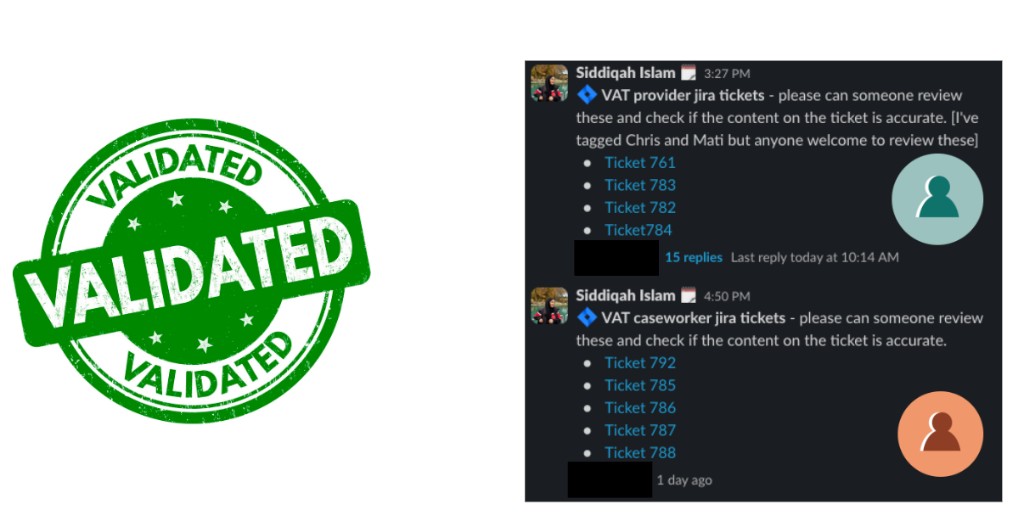
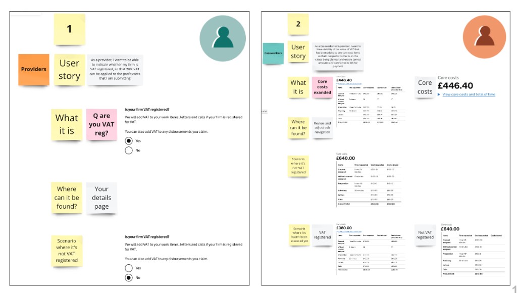
Then, two months before go-live, a new requirement surfaced. During a stakeholder presentation we found out that VAT registration status for provider firms was missing from the service - and caseworkers needed this in the assessment to calculate costs correctly. Rather than raising it as a problem to solve later, I sketched mockups during the call itself, validated with the team and developers immediately, worked with a content designer to get the table headings right, and created the Jira tickets for both the provider and caseworker applications that same day. The team got back on track.
What came out the other side
Usability testing feedback was consistently positive - users described the new service as clearer, easier, and a significant improvement on the eforms they'd been using. Both the provider and caseworker applications went into UAT with both environments working and talking to one another. The VAT requirement was designed, validated, and handed to developers without breaking delivery pace.
“This allows me to view all the necessary details, I know where to look now and the breakdown of the costs and time make it a lot easier than it was before.”
What I learned
Delivery rarely goes in a straight line. The VAT situation could have been a crisis but it wasn't - because I'd built enough trust and communication with the developers that we could move fast when it mattered. That relationship was as much a design output as the screens.