Red Sea Remit
Case Study
October 2019 – January 2020

Overview
Offering Eritreans living in the UK a secure, convenient and fairly priced alternative method of sending money online to their families living in a politically unstable society.
Role
UX design, rapid prototyping – sketching , UI – visual design & collaboration with research
The Challenge
There are limited ways to send money to Eritrea due to the strict Eritrean Government. To get a fair rate, keep their families’ safe from government reprisals, UK based Eritreans have to travel with large sums of cash to a black market ‘Hwala’ drop off location.
The challenge we ran into was many East Africans would be sceptical about using online methods of payments – our main objective was to focus on how to gain their trust and reassure them their online transactions would be protected and private from the Eritrean government.
The Vision
Red Sea Remit’s (RSR) online service should be able to give more options to transfer money and keep the users privacy and protection from the Eritrean government at the forefront. The remittance service should give users the convenience of paying online to avoid carrying large sums of money across London. The client, RSR, would therefore gain a wider audience and more exposure among the East African community.
What did I do?
Research: Conducted guerrilla research interviews with the team of four, affinity mapping into themes and created insight statements, journey maps and ‘how might we’ questions.
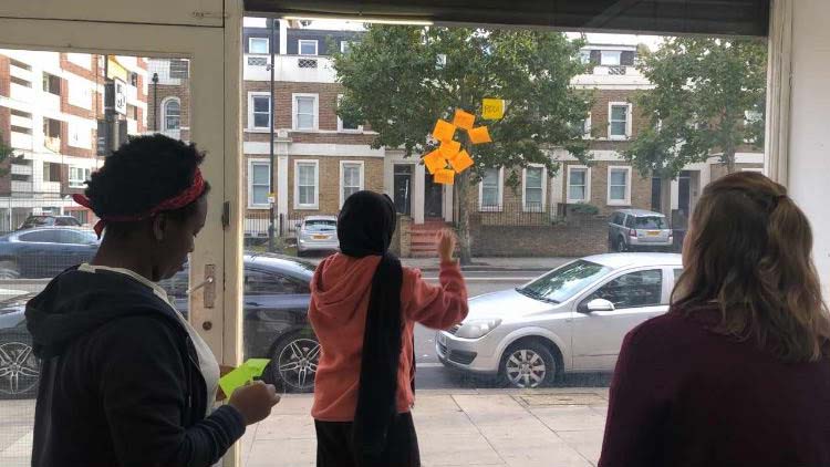

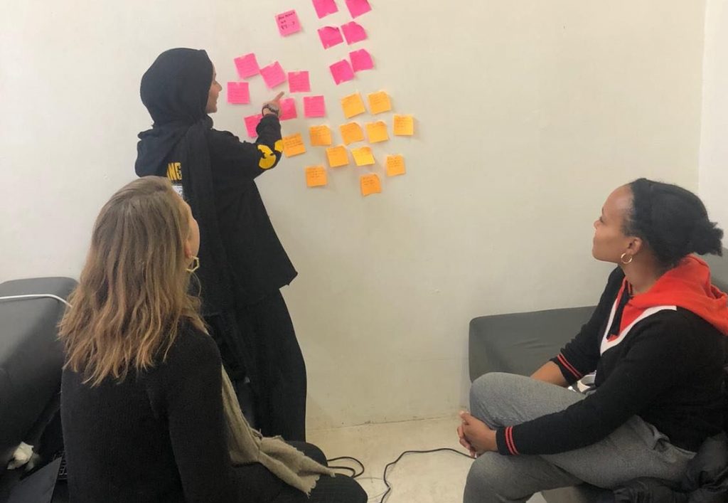
Affinity Mapping, How Might We Q’s, Discussion about HMW Q’s
Design: Helped with both visual and interaction design, including sketches, prototyping and created UI input controls.


Prototyping, Wire-frame Sketches, UI Input Controls
Discovery
To discover the project goals, we kickstarted with a Stakeholder interview, they were passionate about their preference for the Eritrean culture to be displayed on the website. When conducting user interviews, we uncovered that some East Africans were delighted with RSR’s concept – while other users felt unconvinced that privacy from the Eritrean government was deemed impossible.
In order to gain trust from those users who felt sceptical – we had to think of ways to prove legitimacy of protection from RSR’s side. Providing a way for users to ‘erase’ recipient details and an in depth privacy information. User feedback was most vocal about privacy/security and ‘the best rate’ without this there would be no customers; the users were sure of this – so naturally as a team we kept these in mind during any decision-making process.

The team and I conducting user interviews
Ideation
Once we had the big picture and began to identify our problems, we wrote ‘How Might We’ questions in order to explore possible solutions.
Biggest challenge to solve from the HMW questions? “How Might We .. gain trust from users who are skeptical of using online methods?”, Incorporating the East African cultural ‘Habesha’ patterns, users may feel more connected and trust this according to the stakeholders and some of the users.
We then conducted the Crazy 8’s exercise (quantity over quality), and doodled rough solutions that could benefit RSR’s website navigation. A related goal included exploring multiple wireframes for the ‘Check Rates’ feature that was most important to the users, and journey mapping (on the large whiteboard) to identify if we had missed anything. To make sure our journey mapping was most effective for each step we included an ‘Aim’ so that only what was necessary and useful was included.

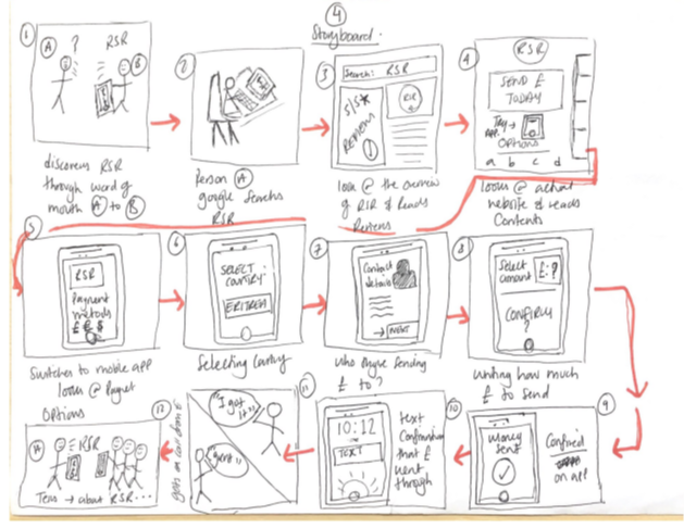
Journey Mapping, Storyboard, Wireframes
When we reviewed our ideas and got to a good spot, we created a mid-fidelity prototype based on user feedback & solutions from the How Might We questions. We showed the users our design & let them test and explore it.
The main theme from user feedback:
- Alter cash option
- Currency converter
- Confidentiality/Anonymity
- Eritrea/Habesha theme
- Online security: data sharing
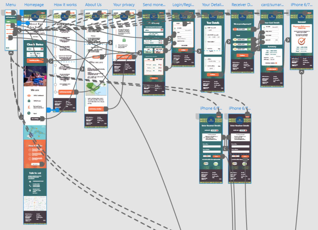
After processing all the feedback from the user tests, we went back to make a note of what needed to be added/ removed – then off to Adobe XD it was!
Screens, screens and more screens
Design – why you’re really here 🙂
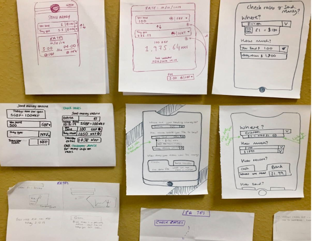
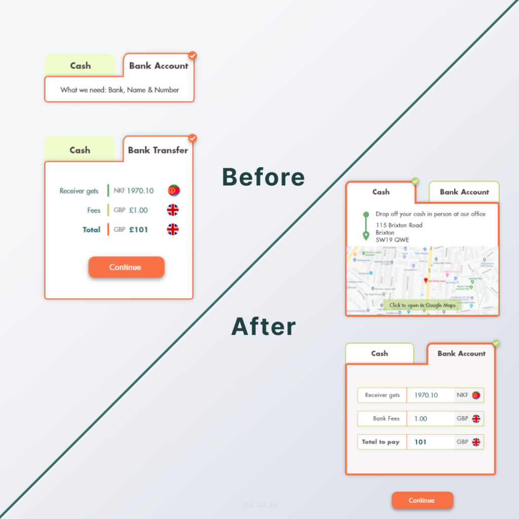
Based on user feedback during the mid-fidelity stage – we redirected users to the office upon selecting ‘Cash’ & made the ‘Bank Account’ summary clearer.
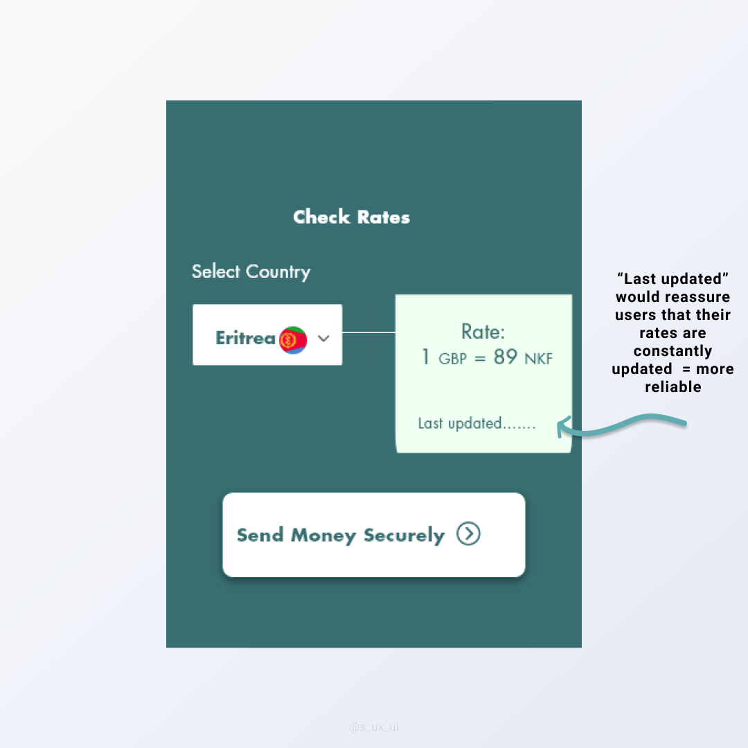
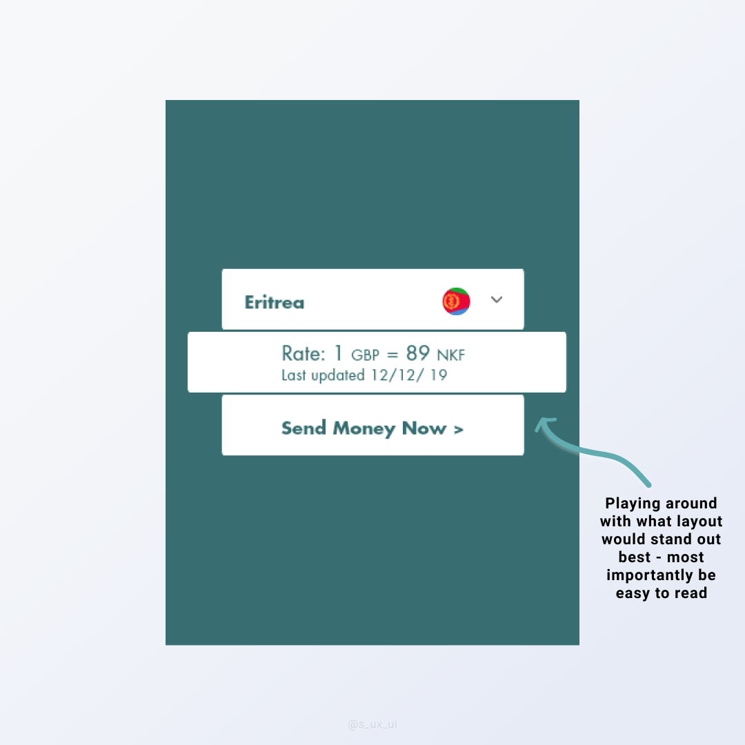
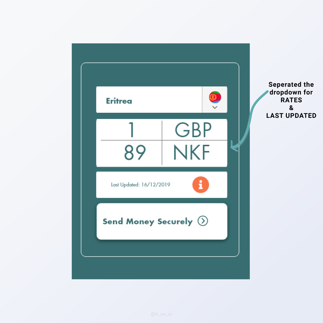
Our attempt to address the changes included refining the design for the rates / currency converter, privacy & how it works – this was to be emphasised on the homepage. Here’s some designs that didn’t make the cut – and some that worked well combined!
Click away to see which features made the cut for our homepage ‘Rates’ feature.


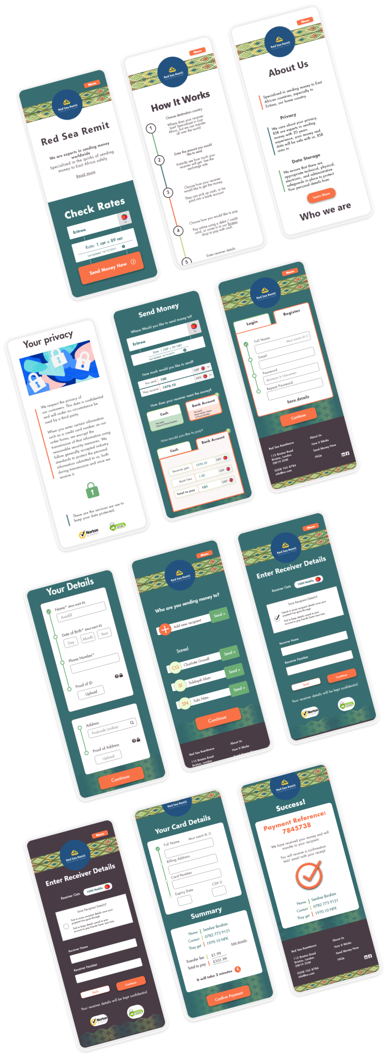
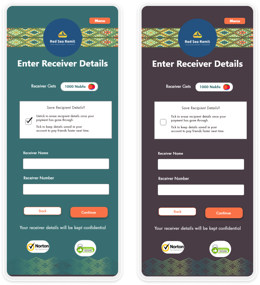
A big theme in this redesign was consistency and easy accessibility. We wanted to simplify the steps in making the transactions and make sure users had a choice to remain anonymous upon transactions. Here’s the tick box feature we choose to do this.
Redesign included grouping card details & summary together on one page instead of two – to speed up the transfer process.

Reassurance for the users that their transactions are in safe hands, included a ‘Success’/ confirmation page which would lead users to: email receipt & text (optional if users opt for both email & text), unique reference number & the recipient’s details to further confirm the money is going to the right place!

Key Takeaways
- Trust the process – think of various ideas, narrow down ideas to most voted, and let the feedback tell you what to do next
- Don’t get too attached – it is sad to let your ideas go, but you have to remember you’re making it for the user /client not yourself
- Note down everything – as a team we were always documenting which helped us in the long run when reviewing our ideas comparing it to user feedback
- Simplicity in necessary – it’s best not to overwhelm users with too much content, only use what is needed nothing more
To Conclude
The stakeholders were impressed with the final result of the prototype and were happy to take it on and build on their website with software developers in their own time. RSR’s usual customer age ranges from 40+ , perhaps if we approached younger East Africans, the age range of 22+, our research may have led us to new ideas that could also work and would have been interesting to see. Overall, I am happy with how the whole process played out.
Check out
Droneification
Re-branding & redesigning a e-commerce website for a bespoke drone company.