Droneification
Case Study
February 2020 – May 2020

Overview
Re-branding and redesigning an e-commerce drone store, Droneification, to gain an online presence, helping promote their products with drop-shipping services and give their brand an identity with their unique blog.
Role
Lead UX design, rapid prototyping – sketching , UI – visual design & collaboration with research
The Challenge
The challenge we ran into was building an identity for a startup brand and helping them gain a customer base by building reputation within the drone community. Due to the nature of Droneification’s services, this would require customers to order online – thus connecting with users is essential. In order to sell such products of high quality and value, customers would need to rely on customer service as well as straightforward navigation on the website.
We were also working on this project during the pandemic – working from home for the most part!
The Vision
Droneificaiton should be an engaging website that is easy to navigate through, display a list of different drones varying in price to target a range of audiences; the outcome of this development will be positive due to different audiences vouching for the company. Our survey that will be discussed later on displayed a demand for drones from different age groups. The blog Droneification provides, should excite drone enthusiasts and for users to learn about technology and trends for drones.
What did I do?
Research: Lead design sprint method, conducted desk research – trends, prices, target market, user surveys, journey maps, how might we Q’s


User Journey, Discussion with the team, Long term goals & Sprint Questions
Design: Helped with wire-framing, low fidelity prototype, UI design – input controls, colour palettes
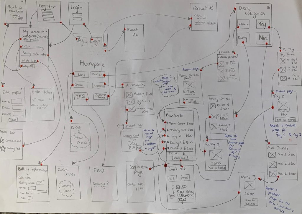
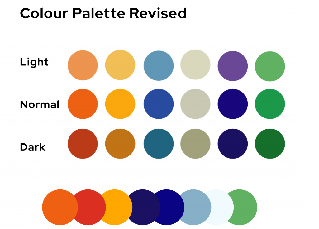

Wire-frame of all screens (thanks Hira for the sketch), Colour Palette, Low fidelity prototype
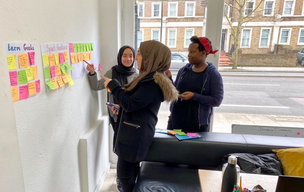
Discovery
To discover the project goals, we assembled a survey that was distributed on multiple social media channels. We discovered our target audience ranged from 16 to 50+ with different backgrounds, careers, lifestyles. Our main priority was to find out how likely users would purchase online – which majority said they would.
We used personas based from our research to help us identify the types of customers that will engage with Droneification online. The survey highlighted specific features and categories the users would be interested in purchasing – with camera drones being the most popular. And of course their budget – with how much they were willing to spend – majority voted on £100 – £900 range.
To analyse our findings and find solutions we used the How Might We questions method, narrowed this down by dot voting, followed by sprint questions and long term goals for Droneification.
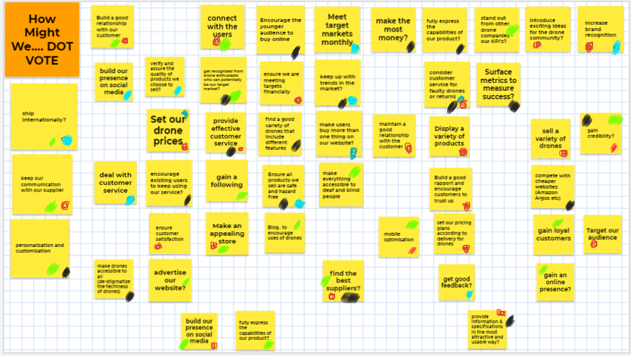
How Might We Q’s, dot voted what felt most important
Ideation
Once we had the big picture and began to identify our problems, we conducted 3 exercises as a team:
- Notes & Ideas –favourite 2 year goal, voted sprint questions, favourite lightning demos
- Crazy 8’s sketches – quantity over quality
- Concept sketch -with annotations for reasons why
As a team we voted on which sketches we liked the most – what we could work on during the mid fidelity stage.
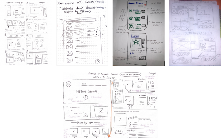
Team concept sketches
We then made user test flows – starting with a realistic entry point and finished with an ideal ending. This was to write a simple story in 6 steps. Once we reviewed our most voted sketches & discussed user test flows we began creating our low fidelity prototype on Figma – we showed our designs to users and gained some insights on how to improve.
Theme of user feedback:
- Add return policy
- Make it easier to navigate back home
- Delete option on basket page
- Images on carousel to direct onto product page
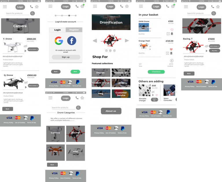
Low fidelity prototype screens – mix of before and after feedback

Screens, screens and more screens
Design – why you’re really here 🙂
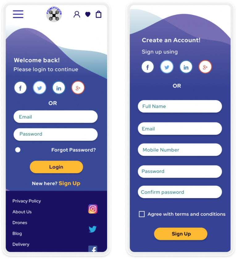
Upon signing up or logging in we opted to give users a choice to sign up from a pre-existing e.g. twitter account or on Droneification. We adopted the ‘blobs’ design throughout the pages.
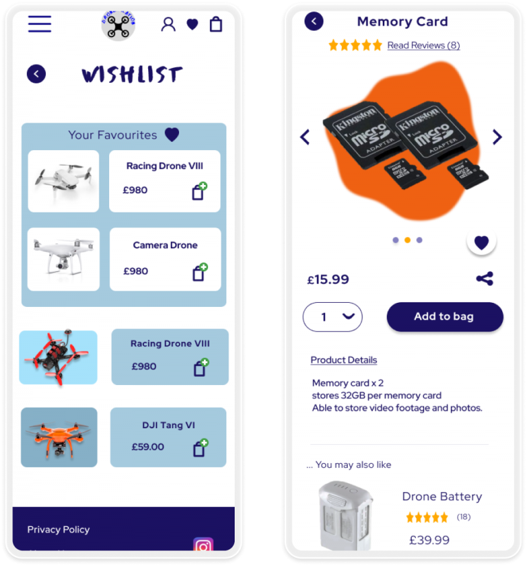
Based on user feedback we included a ‘Wish list’ page – for every time a user clicks on the heart button it gets added to the wish list.
On ‘My Account’ under ‘Order History’ users can track their order and order again.

Users have multiple payment options available to them – option to ‘save for future purchases’ & ‘same shipping information’ to speed up the process.
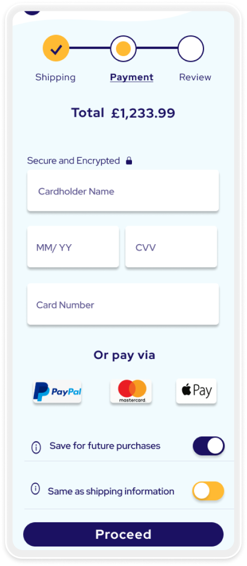
Highlighted by the users to ALWAYS have the total at the top of the page – in case they change their mind and want to add / remove items.

We added a progress bar at the top during the checkout process. This ‘Review’ stage aims to have all necessary information regarding prices and delivery.

Key Takeaways
- Iterate, iterate, iterate – an iterative approach affords us to gain validation along the way
- Creative confidence – act on your big ideas, discuss with your team and tailor it to the user’s needs
- Communication is key – as a team we had to update, notify each other along the way, dedicating a page to each team member then reviewing together was really effective and less time consuming – shout out to Google Hangouts for keeping the team connected
- Make it – it doesn’t have to be perfect, just have it done and adapt/ refine along the way
To Conclude
Under different circumstances we could have used a face to face approach with users and gained insights in real time – our use of surveys however did the job. The stakeholders were pleased with the progress and steps we took to achieve Droneification’s brand – we were given the freedom to select a colour palette and theme. When finishing the project – we handed our prototype to the Droneification team for them to develop. Considering the strange times of lock-down – I’d say as a team we communicated effectively and ultimately got the job done.
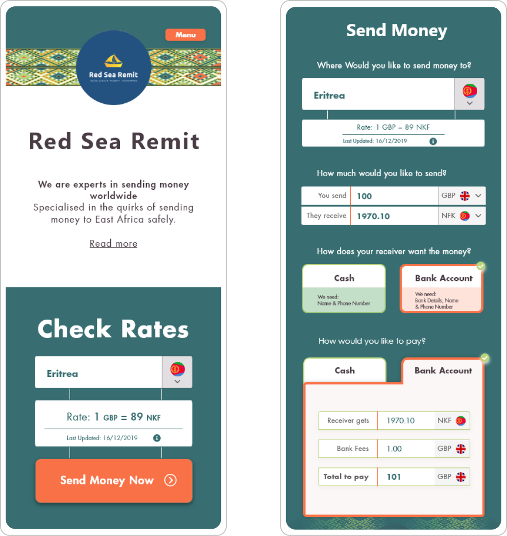
Check out
Red Sea Remit
Designed solutions for an online remittance company – targeted at East Africans.